
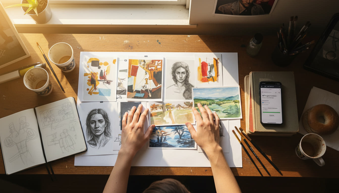
A portfolio is more than a place to store images. For an artist, it can shape how viewers encounter the work: what they notice first, how they move between pieces, and what context they carry away. A thoughtfully designed website can borrow from the logic of a gallery while taking advantage of the screen’s movement, sound, and interactivity.
Think Like a Curator Before Choosing a Template
Begin with the story you want the portfolio to tell. A painter with several connected bodies of work may want visitors to follow a sequence, while an illustrator whose commissions span many styles might make browsing by subject or medium easier. The structure should support the work rather than force every project into the same display.
Choose a small number of clear sections, such as selected work, projects, biography, and contact. Then decide which pieces deserve the most attention. A homepage crowded with every image can make even strong work feel difficult to read. A considered edit gives individual projects room to register and helps visitors understand your practice at a glance.
Use Space, Scale, and Rhythm
In a physical exhibition, distance between works affects the viewing experience. On a website, margins, image size, and the spacing between sections do similar work. Generous white space can make a detailed image feel calm and deliberate; a close grid can suggest energy or abundance. Neither approach is automatically better. The right rhythm depends on the artwork.
Varying scale can also create a visual path. A large lead image might introduce a project, followed by smaller details, sketches, or installation views. Keep captions close enough to their images that the relationship is clear. If a piece needs explanation, provide a concise note rather than asking visitors to guess what they are seeing.
Consistency matters, but uniformity can flatten a portfolio. Use a dependable type system and navigation, then allow each project’s presentation to respond to its materials. A video work, for example, may need a focused page with viewing controls, while a series of prints may benefit from a tidy image sequence.
Make the Work Easy to Experience
Images should be large enough to appreciate without making the site slow or awkward to use. Prepare image files at suitable dimensions, compress them carefully, and test how they appear on both wide and narrow screens. Check color and contrast on more than one device, especially if subtle tonal differences are central to the work.
Accessibility is part of presentation, not an optional technical layer. Give meaningful images descriptive alternative text, use readable text sizes, and make sure navigation works with a keyboard as well as a mouse. Videos should have captions where possible. These choices help more people engage with the work and often make the site clearer for everyone.
Be intentional with motion. A transition or animated detail can reinforce an idea, but constant movement competes with still images and can make browsing tiring. Let visitors control audio and video, and avoid effects that make essential information difficult to reach.
Let the Technology Serve the Concept
Interactive art may call for a site that behaves like part of the work; a straightforward portfolio may need little more than reliable image display and clear navigation. The technical choices should follow the artistic purpose. Before building, write down what a visitor should be able to do and what devices they are likely to use. That short brief can prevent a beautiful concept from becoming confusing in practice.
Artists who want to explain the technical side of digital exhibitions or creative tools can also look at software development publishing sites as one route to reach readers interested in how those projects are made. The most useful writing connects process to a real creative question, rather than treating technology as a list of features.
When It Makes Sense to Hire a Developer
A template can be a good starting point when the goal is a clean, manageable portfolio. Custom help may be worthwhile if you need unusual interactions, a larger archive, or a site that connects to other tools. Before speaking with a developer, collect examples of the mood and functions you want, set a budget, and identify who will update the site after launch.
If you are weighing a Wix build, Osdire’s guide to Wix project red flags can help you prepare questions about scope, cost, and relevant experience. Look for a clear proposal that names deliverables, revision limits, testing, and ownership of the finished work. Be cautious if someone promises a complex result without asking how it should function or gives a price without explaining what is included.
Test the Portfolio as a Visitor Would
Before publishing, ask someone unfamiliar with the work to browse the site on a phone and a computer. Notice where they pause, what they miss, and whether they can find basic information without help. Check every image, link, caption, and contact method. A short test often reveals navigation problems that are invisible when you already know where everything is.
Finally, treat the portfolio as a living exhibition. Add new work with the same care as the first collection, remove pieces that no longer represent your practice, and revisit the site as your priorities change. The strongest digital presentation does not decorate the art; it creates a clear, welcoming frame in which the art can speak.
